
Case study · Client
Restor.eco
The Google Maps of nature, for the world's largest network of restoration sites. The first version was slow and buggy, so a small team rebuilt it from scratch. I was the sole architect of the geospatial and data visualisation frontend.
- Role
- Sole frontend architect, geospatial & data visualisation
- Team
- A small product team, plus scientists from Restor and ETH
- When
- 2022–2025, remote
- Stack
- Next.js, React, TypeScript, deck.gl, GLSL, Google Maps, ArcGIS, visx
- Recognition
- Earthshot Prize finalist, Gold Anthem Award
The product
Restor is a free platform for anyone restoring nature. Landowners, NGOs, companies, governments and researchers draw their site on the map, see its ecological data, from tree cover to biodiversity, and track how it changes over time.
Users include WWF, The Nature Conservancy, Rewilding Europe, the Government of Costa Rica, Salesforce and UBS.
- Nature sites
- 355,000+
- Organisations
- 7,900+
- Nature stewards
- 38,000+
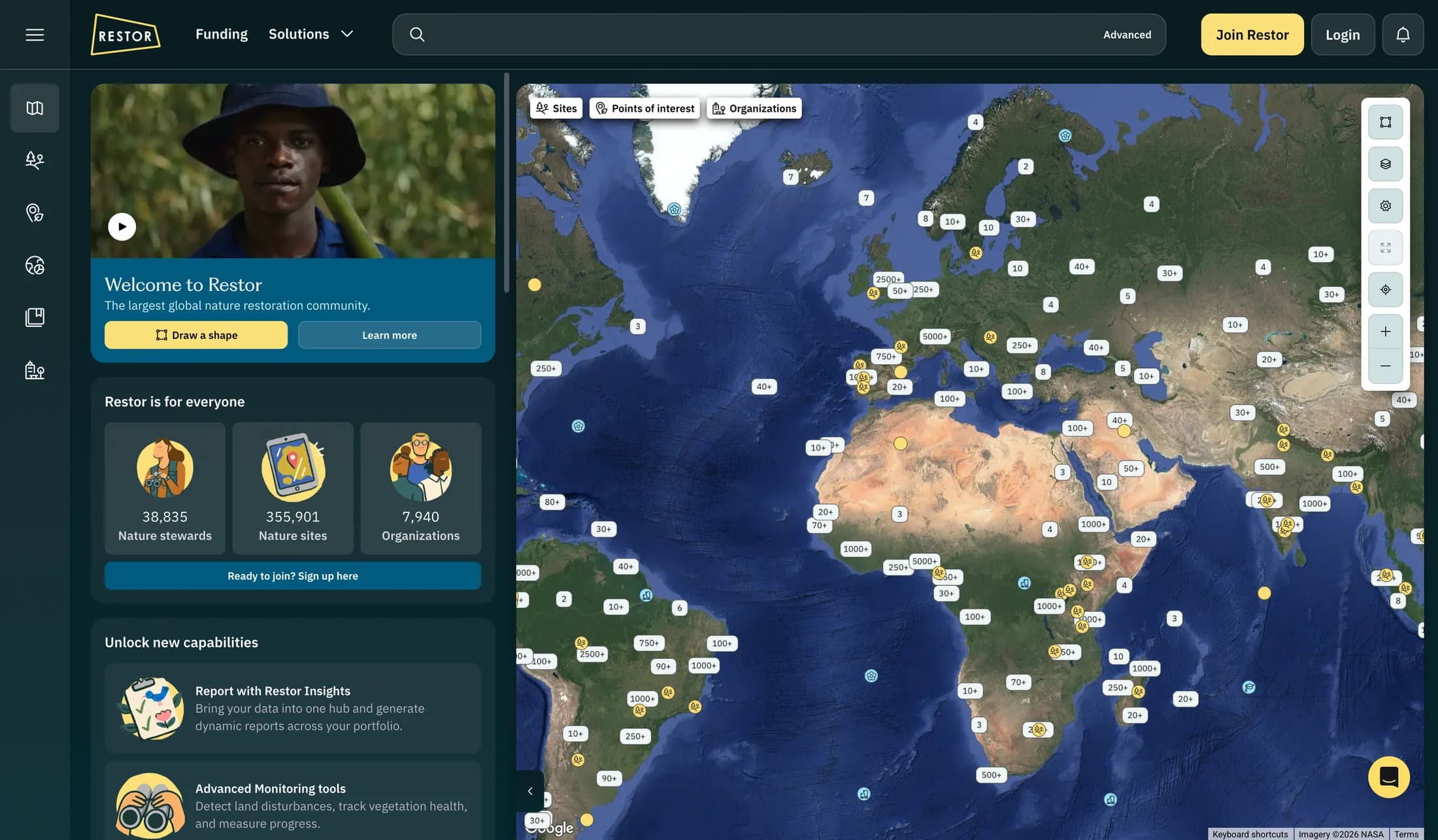
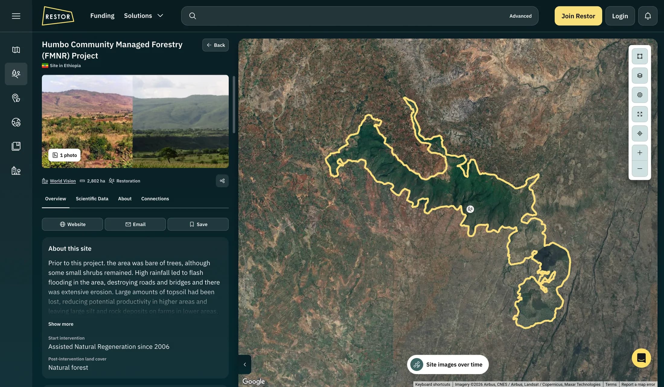
I worked in a small product team of frontend and backend developers, designers, a digital marketer and a product owner, together with scientists from Restor and ETH. Whenever something was geospatial or data visualisation, I usually ended up as the glue between the scientists and everyone else. I studied geodesy, so I could talk projections, resolution and raster data with the scientists. In practice that meant helping shape APIs and interface decisions, and turning a scientific ask into something the developers and designers could understand and build.
Next to that, I worked with the dev team on the rest of the product: authentication, search, the component library, forms, SSR and performance improvements.
Polygon drawer
Problem
I built the first polygon drawer myself during the rewrite, with Google Maps markers for the vertices and polylines for the edges, each its own DOM element. That's fine for a simple shape. But sites on Restor can have up to 20,000 vertices, so 20,000 markers plus 20,000 edges means 40,000 DOM elements, and the browser just gave up.
What I built
So I rebuilt it in WebGL on deck.gl, with three composite layers, one per interaction mode: drawing a new polygon, editing an existing one, and idle. Only the polygon you're actually drawing or editing pays the heavy rendering cost. Self-intersection and overlap checks run in a web worker with Turf.js, and drag state stays out of React entirely.
Result
Sites with complex boundaries, up to 20,000 vertices, can now be edited without freezing or crashing the browser.
Data layers + pixel value inspector
Problem
Restor has 31 scientific data layers from Google Earth Engine, Google's platform for satellite data, from tree cover to soil carbon, each with its own legend and controls. Changing a layer's range or colours made React re-render, and the browser froze. There was also no good way to read the exact value of a single pixel.
What I built
The tiles are greyscale images, where each pixel's brightness stands for a value, like a year or a percentage of tree cover. A custom ShaderBitmapLayer for deck.gl turns that grey into colour on the GPU. The sliders feed straight into the shader, so moving them doesn't re-render React, recompile the shader or refetch tiles.
A tooltip on the map would have clashed with the existing tooltips, so the legend got something like a colour picker instead. On hover, I read that one pixel's grey value back from the GPU and run the same colour gradient on the CPU, so the legend can show exactly where the pixel sits on its scale. I designed the layer panel as well.
Result
Adjusting a layer's range or colours is instant instead of freezing the browser, and you can read the value of any pixel by hovering the legend.
Satellite imagery timelapse
Problem
On Restor you can watch a site change over time, through Esri Wayback, an archive of satellite imagery going back more than a decade. A lot of the people looking are on slow mobile connections, and I didn't want to burn through the data of a farmer in Ghana.
What I built
The viewer runs on the ArcGIS Maps SDK, with one persistent layer per snapshot. Hidden snapshots sit at zero opacity instead of visible: false, so they're never torn down and recreated, and switching is just an opacity flip on tiles the browser already has. On open it only loads the first and last snapshot, the two most likely to be viewed, and hitting play prefetches three ahead.
Result
Switching between loaded snapshots is instant, and Restor's team was pleasantly surprised by how fast it felt. One thing I didn't solve well: a snapshot's date is only correct at the deepest zoom. Zoomed out, the imagery is stitched together from datasets captured at different times, so the date can be wrong. My fix is an admittedly clunky banner that explains this.
Chart composition
Problem
The science team wanted charts for more than 30 ecological metrics, each wired to its own endpoint. A bespoke component per chart was never going to scale.
What I built
The charts are built from eleven primitives on visx (marks, scales, axes, grids and tooltips) that compose as compound components, each with its own isolated state, so axes, tooltips and the rest could be reused across chart types. They're all documented in Storybook.
Result
After the refactor, adding a new chart took about 30 minutes. Those eleven primitives ended up in 100+ distinct charts.
Next case study
Fahsai
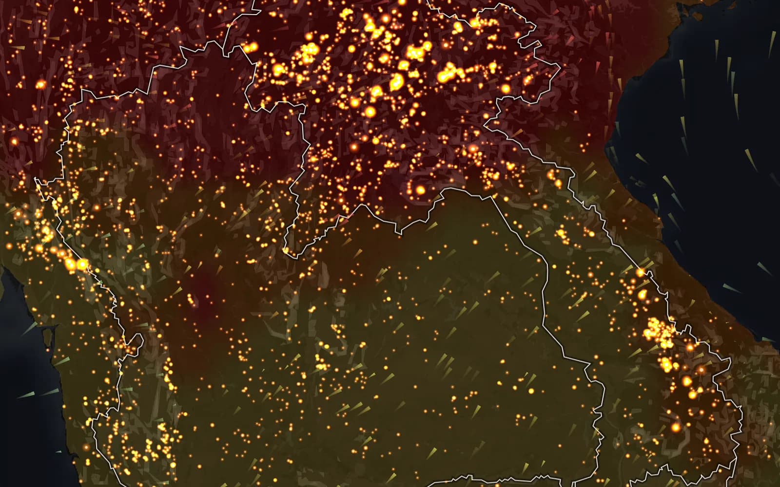
Fires, wind and PM2.5 on one map of Thailand's burning season, with an AI explanation for any station on any day. Designed and built solo, with Claude Code as my pair programmer.
Working on something similar?
I'm looking for my next product engineering role on a data- or map-heavy product. Based in Utrecht, working remote.
dev@joostkiens.com